Anyone can draw lines on a chart and find a means to justify what’s being shown. It was thanks to the DotCom Boom 20 years ago that we’re able to do it today and, in reality, it’s only been mainstream for about the past 10 years when software has allowed for anyone to have access to them.
Putting aside PE Ratios, Elliot Wave Projections, GDP Forecasts, Inflation, Interest Rate, Tariffs and Tea Leaves, I’m throwing up these comparison views of where we came from and how the past looks much like the future – whether we believe it or not.
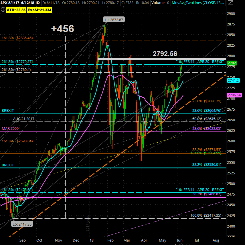
SPX Today From The August Drop
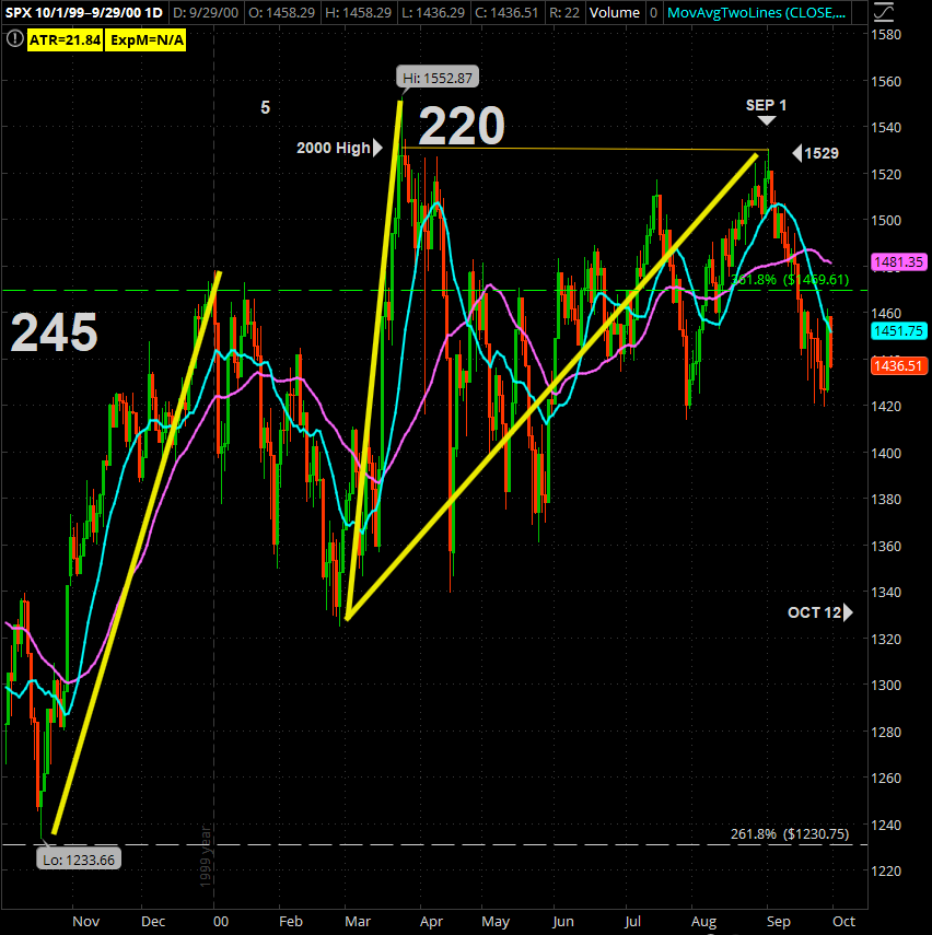
SPX Dot Come Boom Ending Wave
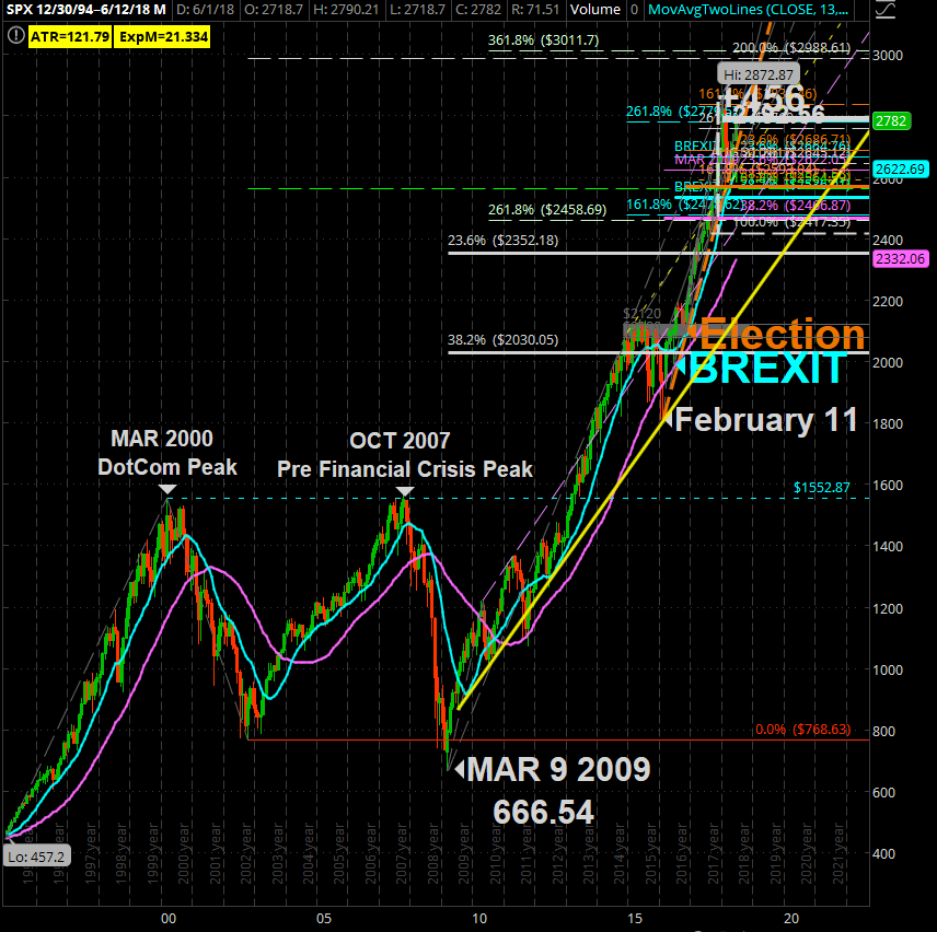
SPX From 1994
SPX OCT 2014 – DEC 2015

Prices go up based on supply and demand and arguing the point that TWTR’s 84.53 PE Ratio or AMZN’s 266.30 do not justify their share prices is a distraction. When I began as a broker in ’97, I watch YHOO go from 9 to 400 before even booking net income and they weren’t even the biggest runner of the period.
What I will make note of is how the EUPHORIC technicals on the longest of time frames lead up to that JAN 26th ATH sell down for the CORRECTION which many saw for the first time in their trading careers left some clues of caution.
The break above SPX 2792.56 on JANUARY 16 proved itself as the LOW on JANUARY 18and we spent 9 Days above that level until we came CRASHING through it on February 2.
It just so works out that the 23.6 (or 76.4 if you draw lines bottom to top) CORRECTION RETRACEMENT tags to 2792.59 – just 0.03 above it.
That 1529 during the DOTCOM dip-bounce could be looked at as our 2792.56 (or actually our 2754).
What we’re likely to see moving forward is how this 2789.56 works out similar to that SPX 2120 did in 2015.
All I’m saying is it’s good to understand what is where and how it aligns with the previous runs. The BIG DIFFERENCE now is the algorithm trading which wasn’t present in the DOTCOM boom so it’s more of a “cup check” rather than a “written in scripture” warning signal.


